When you last bought a bottle of craft beer, what made you choose it above the rest? In a post-BrewDog world, where there are so many craft beers that it can be hard to keep track of each brew's nuanced flavours, we'll actually wager that a large part of the decision was the eye-catching design on the bottle.
From owls wearing suits to ornate playing card designs and African batik prints, a brand's distinctive label is just as important as the beer it makes. We meet some of our favourite craft breweries to find out what goes into their creative process...
Siren Craft Brew
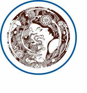
The hook in the bottom of the "S" on Siren's bottles isn't just there to look pretty. Like the name itself – in Greek mythology, sirens were seductive and beautiful creatures who lured sailors towards danger – it signifies the pull of brewing, which founder Darron Anley couldn't resist when he set Siren up in 2012.
"Rather than shouting out into a crowded space, we're all about drawing people in to our beers and our way of thinking," says Andy Nowlan, Siren's marketing manager. "But the beer is always the starting point."
Canopy Beer Co
"Our designer, Wayne Peach, must have had the Grandville animal illustrations tucked away in his inspirations folder and it was he who suggested we use them," says Estelle Theobalds, co-founder of Herne Hill-based Canopy. Sadly Peach, whom Theobalds met through a mutual interest in cycling, passed away last year.
"He was an absolute perfectionist and so enthusiastic about everything we did; I'm just sad that he didn't get a chance to see all the things we're doing now because I think he would be proud of us."
Pressure Drop
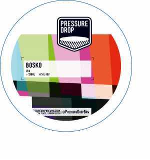
The website ohbeautifulbeer.com – which celebrates great beer label design – was an inspiration for the founders of Pressure Drop. "We wanted to experiment and be creative not only in the beer we produced but also in the way it was packaged," says co-founder Graham O'Brien. The Hackney-based brewers enlisted local designer Francis Redman to design Pressure Drop's logo and typography, and have used several artists to illustrate the labels.
"The Wu Gang Chops The Tree" label was illustrated by Ching-Li Chew, who I know because our kids are friends at school," he explains. "The photo on the ENZ label was taken by Javier Gonzalez, who works on our bottling line." The designs don't so much reflect the brewery's philosophy as its personality, he says. "If you look at many of the new crop of breweries, you can get a sense of personality from the labels. I think that's important, but it's hard to define."
Brixton Brewery
Back in 2012, when the founders of Brixton Brewery needed inspiration for their label designs, they went for a wander. "We wanted them to convey the identity of Brixton, and a sense of where the brewery was located," says one of those founders, Jez Galaun. "We identified places, shapes or forms that we could bring through in the branding." When the team saw African batik fabrics in Brixton Market, they knew they'd struck gold. "They've got that colourful, multi-layered printing – they're block-printed, so nothing lines up quite right." All of the brewery's beers are named after local landmarks, objects, places or streets.
Gipsy Hill
"We'd seen some great work Marcus Reed had done using a character he'd created," says Charlie Shaw, one of the founders of South London's Gispy Hill Brewing Company. "We liked its simplicity and clarity and it looked very fresh, so our brief to him was to simply adapt that same character – in that same style – to become us." Each of the founders is featured on one of the labels, and Shaw is Southpaw.
It was just me at the very beginning and Southpaw was actually the only beer that was my recipe – I first brewed it when I was working at Five Points." The decision to feature a character on each label was, as Shaw admits, a bit of a risky one. "Companies don't often use people on their branding; apparently it can get you into all sort of problems if you're not careful." But he's happy with the results. "I think if you get away with the character brand thing, it can be quite powerful and recognisable. In our case it also led to us being able to have a lot of fun with our specials…"
Wild Card
The labels for Walthamstow's Wild Card Brewery were designed by collage artist Valero Doval, a friend of director Andrew Birkby. "When we decided to have a go at making it a business – with no experience and no money – we called ourselves Wild Card Brewery," he says.
"When we asked Valero to do the labels, the only brief was that is should be a playing card design, without any logo or branding on it." Doval was responsible for the bird motif: "We love them – they give each beer a different character," says Birkby.
Mondo
"We're steeped in culture and music. That's what drew us all together before we started this company," explains Thomas Palmer, director and head brewer at Battersea's Mondo Brewing Company. Books, films and music provide much of the inspiration not just for the ethos of the brewery, but the designs, too. The artwork featured on the labels was created by Los Angeles-based designer Chris Vagnoni, whom Palmers shared a house with in central LA.
From early conversations over Skype, Vagnoni developed initial drawings, which he finally made into oil paintings. His wife – a talented photographer – made hi-res images and sent them over to be incorporated into the label designs. The comic aesthetic of Mondo's labels is key, according to Palmer.
"Beer is a fun product. We respect it and what it does for celebrations, milestones, and ritual events in peoples lives. For us it enhances the joy and celebratory atmosphere of life. We've often taken a comical approach that we feel adds to that."
Weird Beard Brew Co

West London-based Weird Beard's labels are probably best known for their Iron Maiden-inspired skull, affectionately known as Lup'in, "since he has hops for eyes and hops contain lupulin," according to communications manager Natasha Wolf. The first Weird Beard labels were knocked up by co-founder Gregg Irwin, but he and other co-founder Bryan Spooner were soon approached by designers Chris Walker and Josh Smith.
"Chris and Josh saw potential in the brand and loved the beers, so they wanted to help out," explains Wolf. "We had an idea for the brand but not really the skills, time or budget to push it, so this was ideal." Walker still designs the labels today. "Even as an out-of-house designer, he's an integral cog of Team Weird Beard," she adds.
Each Lup'in is designed to reflect the character of the beer in the bottle, like Black Perle (named for the ship in the Pirates of the Caribbean films, Black Pearl), the brand's coffee milk stout. "It has a pirate skull with a coffee bean on the eye-patch," says Wolf. "We brew what we want, when we want, and we put our individuality into the beers we make. At the same time, the beers we release have their own identity; each brew has its own character, and that makes it a special entity in itself."